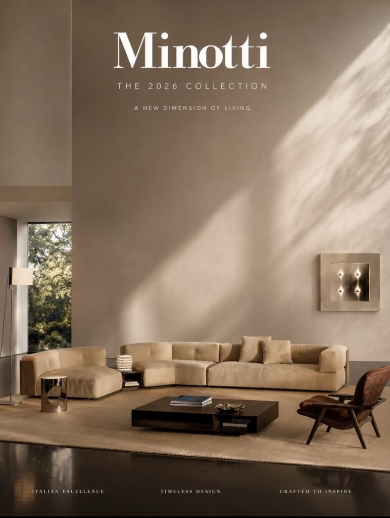
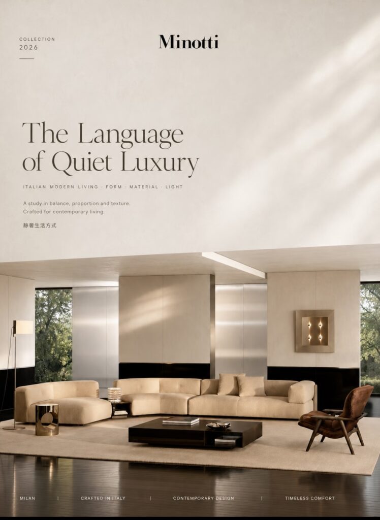
When you unpack the concept of “high-end luxury,” it’s really all about the materials doing the talking—a philosophy truly embodied by Minotti.
Truly enduring spaces are rarely cluttered or piled high with unnecessary decor.
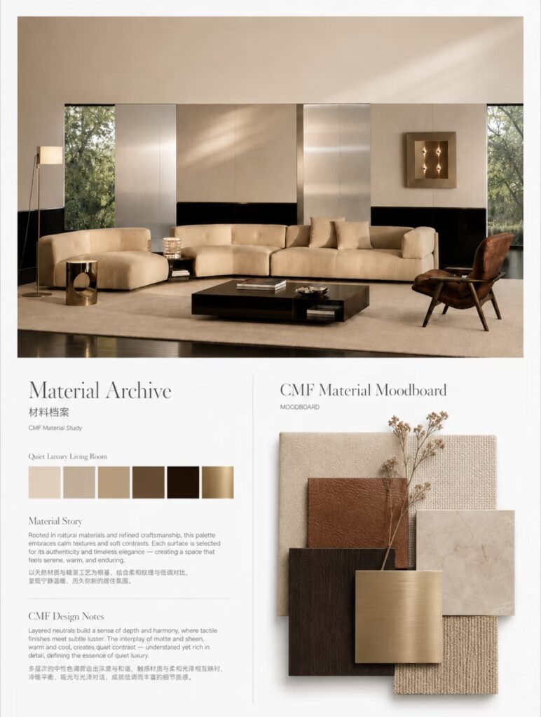
In this Minotti-inspired living room setup, I focused heavily on the relationship between textures and materials: the softness of off-white bouclé, the grounded tone of dark wood, the restraint of warm metallic accents, and the crispness of light stone—punctuated by just a touch of caramel brown to hold the space together.
There are no overly complex shapes or forced “luxury” aesthetics here. It’s simply about tuning proportion, tactile feel, sheen, and color temperature to the exact same rhythm.
And that is what I value most when developing CMF (Color, Material, Finish) solutions for Minotti designs: it’s not about picking a single material that looks good on its own, but rather bringing materials together so they elevate one another.
Quiet Luxury is never about loud branding—it’s about every single detail being hit just right.
Here are the exact HEX color codes for the Minotti CMF Palette, listed from left to right:
- Warm Sand / Oat: #E2D7C5
- Taupe / Greige: #BFA892
- Toffee / Warm Leather: #885A3B
- Dark Espresso / Walnut: #3B2C24
- Obsidian / Piano Black: #1A1615
- Brushed Brass / Antique Gold: #A68A56